
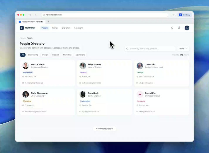
Visual recreated for portfolio use to respect NDA requirements.
Apple
Senior UX Designer
IdMSControls Engineering
This project focused on turning directory access from a separate lookup experience into a contextual system that could support everyday workflows.
Employees often needed quick access to information about coworkers, groups, or locations while already working inside another tool. Instead of getting that information in context, they had to leave what they were doing, open a separate directory experience, search again, and then return to their original task.
Instead of treating directory access as a separate destination, I reframed it as an embedded workflow layer. The goal was to reduce context switching, make information faster to scan, and create a repeatable pattern that could scale across internal tools, browser surfaces, and developer integrations.
As the sole designer on the team, I led the design from problem framing through final direction, defining the interaction patterns, system behavior, and integration approach that shaped the platform.
Context
This work was created within IdMSControls Engineering, where internal tools supported a wide range of employee workflows across Apple.
Directory information was already valuable, but the experience was fragmented. It lived outside the moments where people actually needed it. That disconnect made simple lookups slower than they should have been and added friction to everyday work.
Rather than treating directory access as a standalone app problem, I approached it as a workflow problem. The challenge was not just helping users find information. It was helping them access the right information without breaking focus.



Problem
Directory access was separated from the work itself
Employees frequently needed quick context on a person, group, or location while already in the middle of another task. But instead of accessing that information where the work was happening, they had to jump to a separate directory tool.
That created a repeated pattern of friction:
-
users had to pause the task they were already doing
-
they had to repeat the same search across disconnected tools
-
they had to copy or memorize what they needed
-
they then had to return and reorient themselves
What sounds like a small interruption became a repeated productivity tax across everyday work.
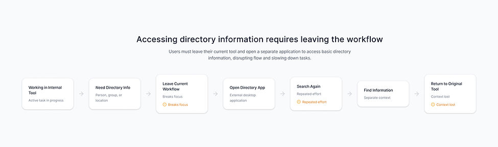
Before State
A typical workflow looked like this
-
A user is working inside an internal tool
-
They need context on a person, group, or building
-
They leave the current experience to open a separate directory tool
-
They search again for the same information
-
They copy, memorize, or reference what they need
-
They return to the original task and find their place again
The issue was not that directory information did not exist. The issue was that access to it was disconnected from the work itself.
My Role
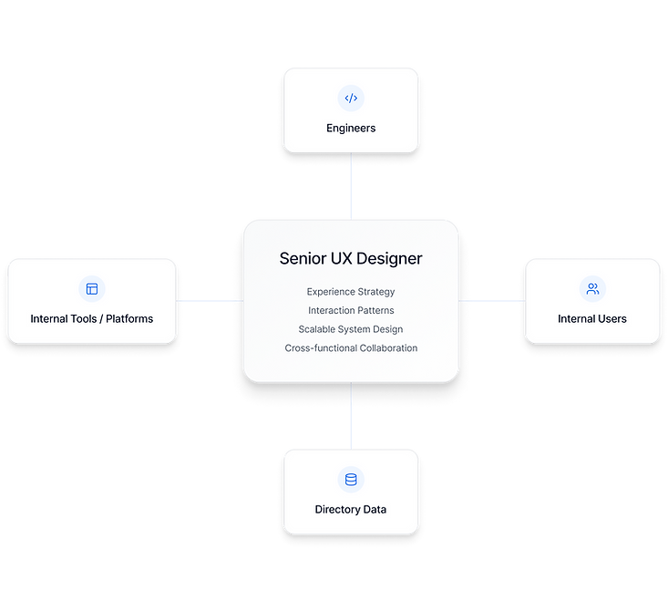
As the sole designer on the team, I was responsible for shaping the experience from concept through direction.
-
framing the workflow problem and identifying where users were losing time and context
-
defining the experience strategy for bringing directory access into existing tools
-
designing a reusable pattern that could support people, groups, and locations
-
exploring how the system could scale across embedded, browser, and cross-product surfaces
-
partnering closely with engineers and cross-functional collaborators to align the design with technical feasibility and long-term adoption
My role included:
Research and Discovery
📚 Research
To understand where the experience was breaking down, I focused on the moments when employees needed directory information while already working inside another tool.
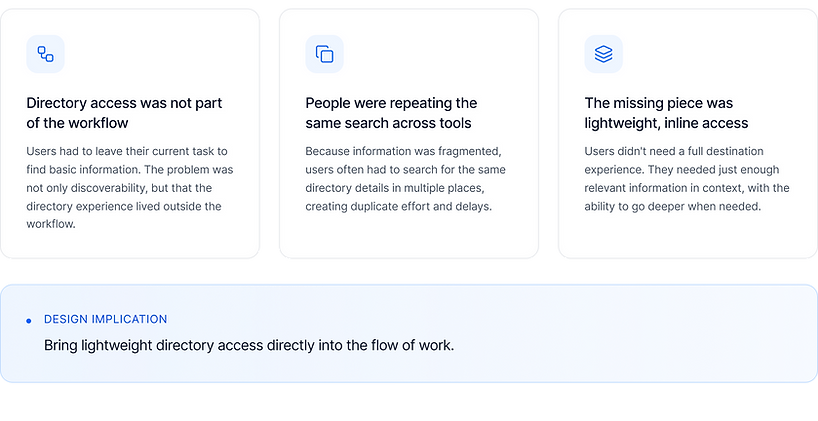
The pattern became clear: the directory itself was useful, but access to it was disconnected from the workflow. Users were not struggling because the information did not exist. They were struggling because retrieving it required leaving their current context, repeating a search, and then returning to the task they had paused.
1. Directory access was happening too late
Users often needed information about a person, group, or location in the middle of another workflow. By the time they opened a separate directory tool, they had already broken focus.
2. The same information was being searched repeatedly
Because directory access was not available across surfaces, users often repeated the same lookup across disconnected tools.
3. Most use cases did not require a full destination experience
In many moments, users only needed lightweight context: enough information to confirm who someone was, understand where they belonged, or take a quick action.
4. Opportunity wasn't a better search page, it was contextual access
The strongest direction was to bring directory information closer to the point of need, while still supporting deeper exploration when necessary.
"I have to leave my current tool just to look someone up, then come back and find my place again. "
Team Member
“It feels like I’m searching for the same information multiple times across different tools.”
Internal User
Key Insights
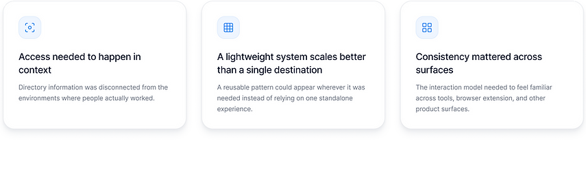
Access needed to happen in context
The main usability issue was not that employees lacked directory information. It was that the information lived outside the environments where people needed it most.
Lightweight access was more valuable than another destination
A full directory experience still had value, but many daily use cases only required fast, scannable context. This pointed toward an embedded card system instead of another standalone flow.
Consistency was critical for scale
If directory information appeared across internal tools, browser surfaces, and developer integrations, the interaction model needed to feel familiar everywhere.
Adoption had to be designed into the system
The experience could not only work for end users. It also had to be easy for internal teams and developers to adopt, extend, and integrate into their own workflows.
Key Design Decisions
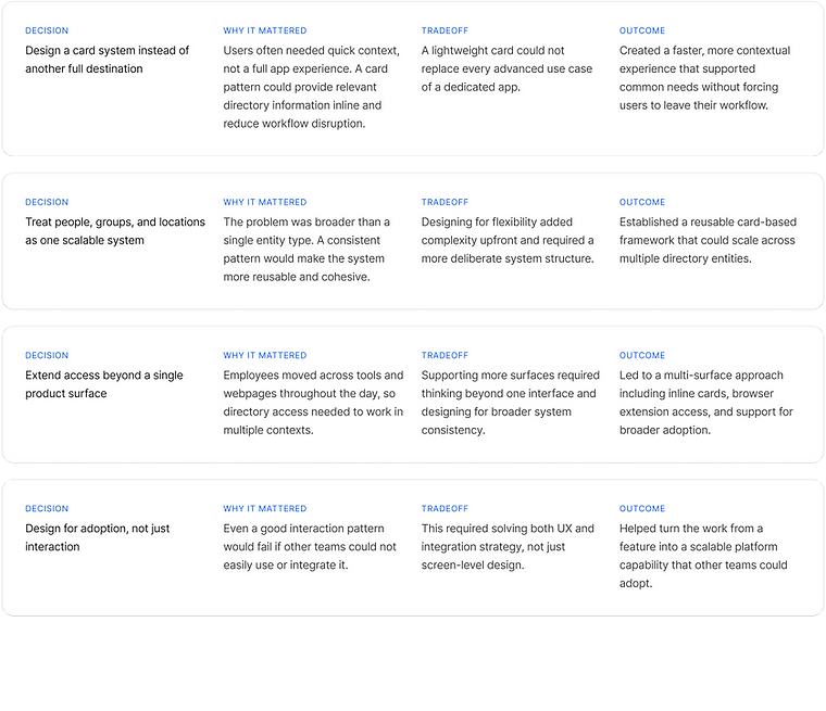
1. Design a card system instead of another full destination
A standalone directory experience was useful for deeper exploration, but it did not solve the everyday moments where users needed quick context. I designed a lightweight card pattern so directory information could appear directly inside the flow of work.
2. Create one system for people, groups, and locations
Rather than designing separate patterns for each entity type, I created a flexible structure that could support people, groups, and buildings with consistent hierarchy, behavior, and actions.
3. Support multiple access points
Employees move across tools, webpages, and internal systems throughout the day. The solution needed to work across those surfaces, which led to three connected access points: inline cards, a Safari extension, and a developer integration model.
4. Design for adoption, not just interaction
For the platform to scale, other teams needed a clear way to use it. I considered integration and implementation as part of the product experience, not as an afterthought.
Solution
🧠 Intro
To solve this, I designed a lightweight directory platform that made employee information accessible wherever users were already working.
Rather than forcing users into a separate destination, the system makes directory access feel embedded, contextual, and available on demand.
The platform was built around three connected parts: inline directory cards for embedded workflows, a Safari extension for quick cross-surface access, and a developer integration model that helped other teams adopt the pattern.
Design
Inline Directory Cards
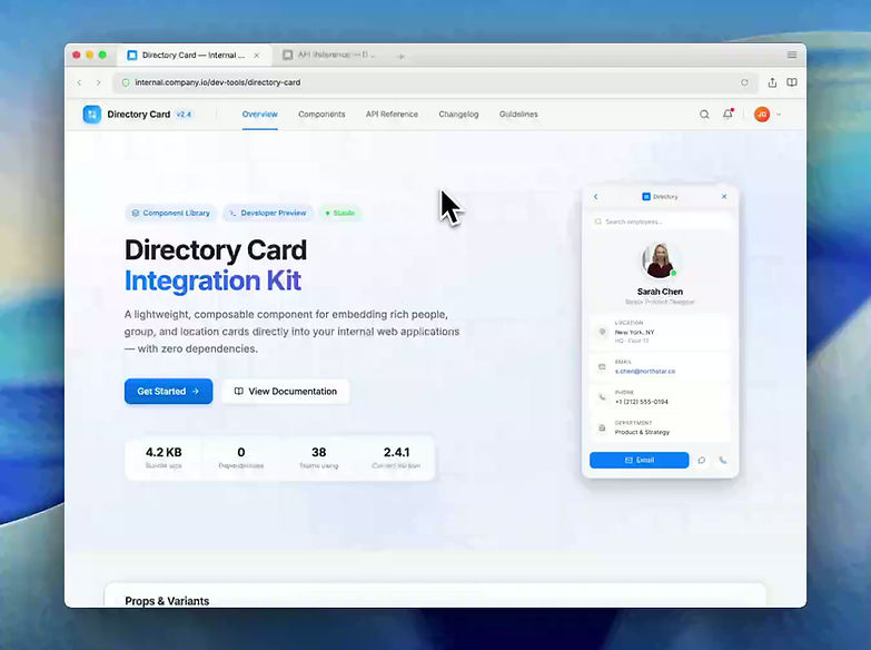
The core of the platform was a lightweight card pattern that could be embedded directly inside internal tools.
The cards gave users quick access to relevant information about people, groups, and locations without forcing them to leave their current task. They were designed for fast scanning first, with clear hierarchy, lightweight actions, and a path to deeper detail when needed.
This made directory access feel like part of the workflow instead of a detour from it.
Design
Safari Extension
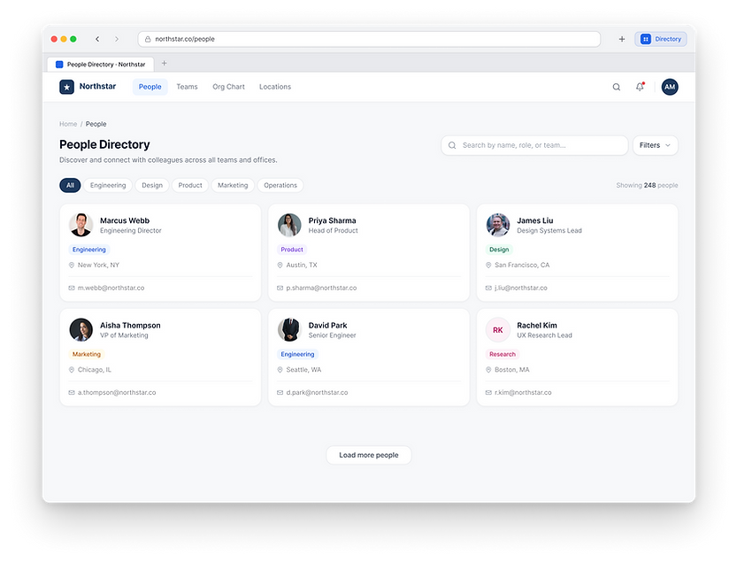
To support moments where directory information was needed outside an embedded product experience, I designed a Safari extension that gave users quick access from any webpage.
The extension extended the same interaction model beyond a single tool, allowing employees to search, preview, and act on directory information without fully switching contexts.
It reinforced the broader product principle: directory access should meet users where they already are.
Design
Developer Integration
To help the system scale, I designed an integration model that made it easier for internal teams to embed directory cards into their own tools.
This was important because the success of the platform depended on adoption. The pattern needed to be reusable, understandable, and flexible enough to support different product contexts without requiring each team to solve the same problem from scratch.
By designing the integration model as part of the experience, the work became more than a feature. It became a platform capability.
Iteration and Refinement
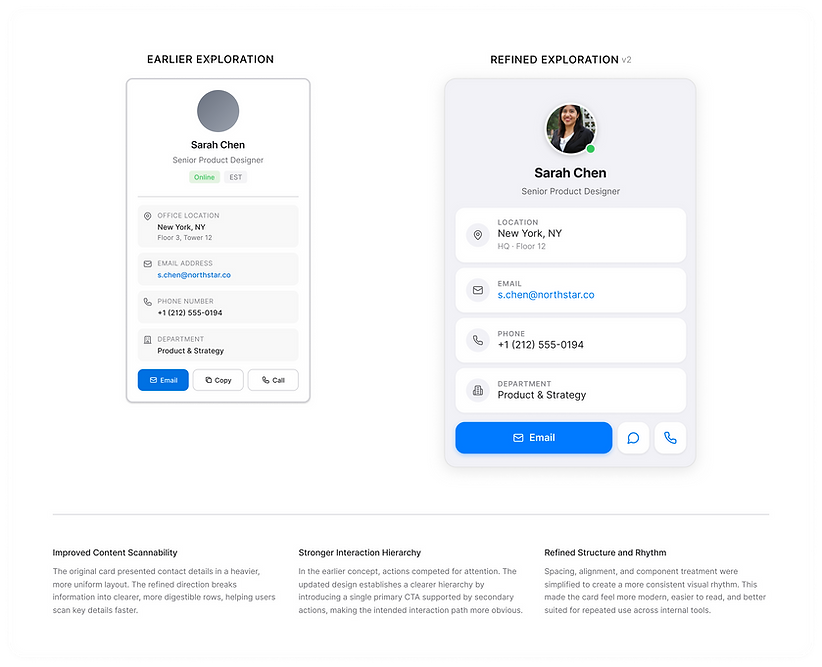
One of the biggest refinements was deciding how much information the card should expose at first glance.
The earlier exploration included the right information, but the layout felt more like a compact profile form than a lightweight workflow card. Important details were stacked evenly, which made the experience functional but harder to scan quickly. The actions also carried similar visual weight, making it less clear what the primary next step should be.
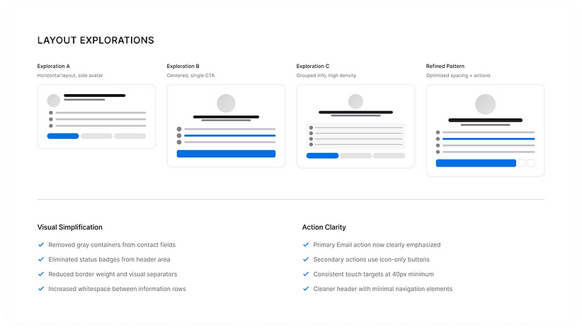
In the refined version, I focused on hierarchy, spacing, and progressive emphasis. The most important identity information appears first, supporting details are grouped into clearer rows, and the primary action is visually prioritized while secondary actions remain available.
What changed
Stronger visual hierarchy
The refined card makes the person’s identity easier to recognize first, then lets users scan supporting details like location, email, phone, and department.
Clearer grouping
Instead of treating every field like a separate form item, the refined version groups information into larger, more readable sections with consistent icon placement and spacing.
More intentional actions
Email became the primary action because it was the most common lightweight next step, while message and phone actions were still accessible as secondary options.
More polished interaction pattern
The refined version feels more reusable across surfaces because the layout is cleaner, more spacious, and easier to adapt to different card types.
Why it mattered
This refinement helped shift the card from simply displaying directory information to supporting fast recognition and action. The goal was not to show everything at once. It was to make the most useful information easy to understand in the moment, while keeping the experience lightweight enough to appear across different internal tools.
Impact
🚀 Results
This work helped shift directory access from a separate destination into a reusable system that could appear inside everyday workflows.
While I cannot share internal metrics, the outcome created a stronger foundation for how employee, group, and location information could be accessed across internal products. The platform reduced reliance on separate lookup flows, introduced a consistent interaction pattern, and gave internal teams a clearer path for embedding directory access into their own tools.
Key Outcomes
-
Reduced workflow disruption by bringing directory information closer to the point of need
-
Created a reusable card pattern for people, groups, and locations
-
Extended access through embedded surfaces, browser access, and developer integration
-
Improved consistency in how directory information could be presented across internal tools
-
Helped turn directory access from a standalone lookup experience into a scalable platform capability
Reflection
This project reinforced that strong internal-tool design is not just about adding functionality. It is about removing friction from the small, repeated moments that shape how people work every day.
It also pushed me to design beyond a single interface. The real challenge was creating a system that could behave consistently across tools, scale across teams, and stay lightweight enough to support frequent use.
If I were continuing this work, I would explore more contextual triggers, deeper integrations into high-frequency workflows, and additional ways to help teams adopt the pattern without creating inconsistent versions of the experience.
Confidentiality Notice
This case study is based on my experience designing internal tools at Apple. Due to confidentiality, all visuals and examples have been recreated and simplified to represent the design approach, system thinking, and interaction model without exposing proprietary information.